Let's talk about pink. For many of us, it lives in a very small box marked little girls and Barbie, and we are told we should grow out of it. I couldn't disagree more! Pink is one of the most versatile colours going, and I would love to show you why.
The surprising history of pink
The word itself only arrived towards the end of the 17th century, most likely borrowed from plants and flowers with a rosy hue. By the 18th century, it was all the rage. Rather surprisingly by today's standards, people considered it a more masculine colour. Red symbolised power and strength, so this shade was essentially its softer, paler cousin. Men regularly dressed in it, and it became particularly en vogue among the bourgeoisie.
Things changed after the Second World War. Marketing took off, and well-known female icons embraced the colour, so its link with femininity became firmly fixed. In other words, that 'girls only' label is surprisingly recent. The pink-for-girls rule was never really a rule at all. For more colourful design history, the V&A is brilliant for a wander, even online.
Why pink is like your favourite jeans
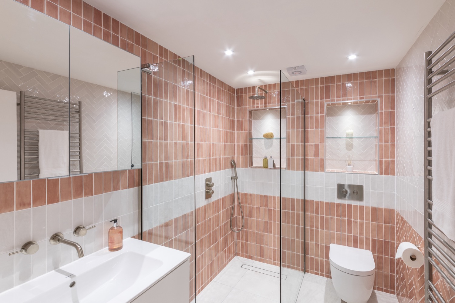
To me, pink is a bit like jeans. It goes with almost anything you put beside it. Start with red as its base and it feels naturally rich and warm. Add more blue and it moves towards purple. Add more yellow and you head for coral. Then add white for a soft pastel, or use less white to bring out something bolder and more vibrant.
Gentle or punchy, you choose
It can be gentle and soothing. It can also be punchy and invigorating. Ask a group of friends to show you the ultimate pink and you will see a whole spectrum of different hues. It is surprisingly hard to pin down, and that is precisely what makes it so versatile. It is not even a colour of the rainbow!
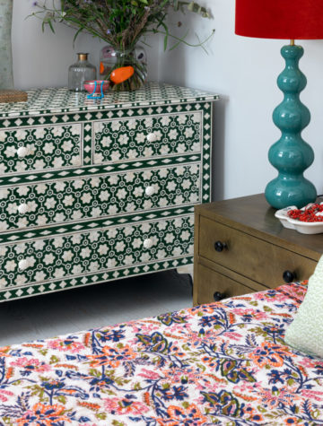
That flexibility is why it plays so nicely with others. Pair it with crisp white for freshness, with chocolate brown for warmth, or with deep green for a little drama. It always seems to know its role in the room.
How to use pink in your home
You do not need to paint every wall. Even the smallest hint of pink lifts a scheme and draws out the tones around it. Think of it like a pinch of salt in cooking: it makes everything else taste better. It can bring a sense of history and timelessness, while also adding fun, freshness and a feeling of progression. Here are a few easy ways to begin:
- Layer pink with neutrals, such as a blush cushion or throw on a grey sofa, to soften crisp whites and cool tones.
- Pair pink with deep greens or navy for a rich, grown-up contrast that feels confident.
- Choose a coral-leaning shade for a hallway or snug, where you want a burst of energy.
- Keep things soft in a bedroom, where a gentle pastel can help the space feel calm.
Not sure which shade suits your space? That is completely normal. Light, layout and the colours you already love all play a part, so it helps to see samples in your own room. Our about page explains how we approach every home, and you are always welcome to get in touch for a chat.
A colour made for living
At Anna Auzins, we believe good design should make you feel wonderful. We create beautiful, functional interiors that confer a sense of wellbeing, and homes meant to be lived in and loved for years to come. A touch of pink can do exactly that. You can browse more ideas on our blog or see our broad range of styles on the homepage.
So please, do not rule it out. Give it a go in a cushion, a front door or a whole room. After all, it is just another version of red.